
Fountain Pen Nib Size Comparison: The 2026 Master Guide
The most frustrating secret in the analog world is that a "Medium" nib doesn't actually exist as a universal standard. Your favorite Japanese Fine nib might write like a Western Extra Fine, leaving you with a line that feels thin and scratchy instead of precise. This fountain pen nib size comparison guide is designed to eliminate the guesswork from your next acquisition. We understand that the tactile joy of writing depends on finding that perfect balance between ink flow and paper surface.
It's disappointing when a broad nib feathers on your journal or a fine nib catches on the page fibers. You deserve a tool that responds exactly how you expect. We'll help you master these nuances so you can select and refine your instrument for a truly tailored experience. This guide explores the specific differences between Japanese and European makers, the impact of paper quality, and how to choose a size that complements your unique handwriting style.
Key Takeaways
- Learn that nib size describes the width of the tipping material at the end of the tines. This helps you understand why "Fine" is a relative descriptor rather than a fixed measurement.
- Master the "one size down" rule for a precise fountain pen nib size comparison between Japanese heritage brands and broader Western manufacturers.
- Discover how capillary action and ink flow volume can transform a nib's performance regardless of its physical dimensions.
- Use the "X-Height" diagnostic to measure your handwriting and select the ideal nib for your daily journals or planners.
- Identify why alignment is often the root cause of writing dissatisfaction and learn how to safely tune your instrument.
Defining Nib Size: The Mechanics of the Tipping Point
When you hold a fine writing instrument, the point of contact between your thoughts and the paper is a microscopic bead of metal. This is the tipping material. While we often speak of nibs in broad strokes like "Fine" or "Broad," these terms don't represent a universal measurement. Instead, they describe the width of the tipping material welded to the end of the tines. A comprehensive fountain pen nib size comparison reveals that these designations are often subjective; they're more like regional dialects than a strict global language.
Finding your "Goldilocks" nib is about balancing line width with tactile feedback. Heritage makers like Sailor, Pilot, or Lamy have spent decades, sometimes centuries, refining their specific standards. As a boutique curator, I view these variations not as inconsistencies, but as a commitment to a specific writing culture. Understanding the mechanics of a fountain pen nib is the first step toward achieving that elusive, perfect analog experience where the pen disappears and only the words remain.
Tipping Material and Geometry
The longevity of a quality nib depends on the hard-wearing alloys found at the tip. While many enthusiasts still refer to this as "iridium," modern manufacturers typically use complex groups of platinum-group metals to ensure the pen survives decades of friction. The geometry of this tipping defines how the pen feels as it moves across the page. Round nibs are the standard for daily writing because they offer a consistent line regardless of the angle at which you hold the pen. Specialty shapes, such as stubs or italics, are ground flat to create line variation, but they require a more disciplined hand. For those just starting their collection, a round tipping geometry provides the most reliable and forgiving entry point.
Tuning vs. Size Selection
It's easy to mistake a poorly tuned nib for the wrong size. Size selection determines your baseline line width, but tuning is what adjusts the ink flow and "smoothness." A well-tuned Fine nib can often feel more luxurious and glide more easily than a scratchy, misaligned Medium. Most dissatisfaction with a new pen stems from the alignment of the tines rather than the physical width of the tipping. Before you decide a nib is too fine or too broad, ensure the tines are perfectly parallel. Preserving the manufacturer's original tipping is vital; you should only consider aggressive grinding after you've mastered the basics of flow adjustment on less expensive, "sacrificial" pens. Choosing the right size is the foundation, but proper tuning is the finishing touch that makes a pen truly yours.
The Global Standard: Comparing Japanese and Western Nib Widths
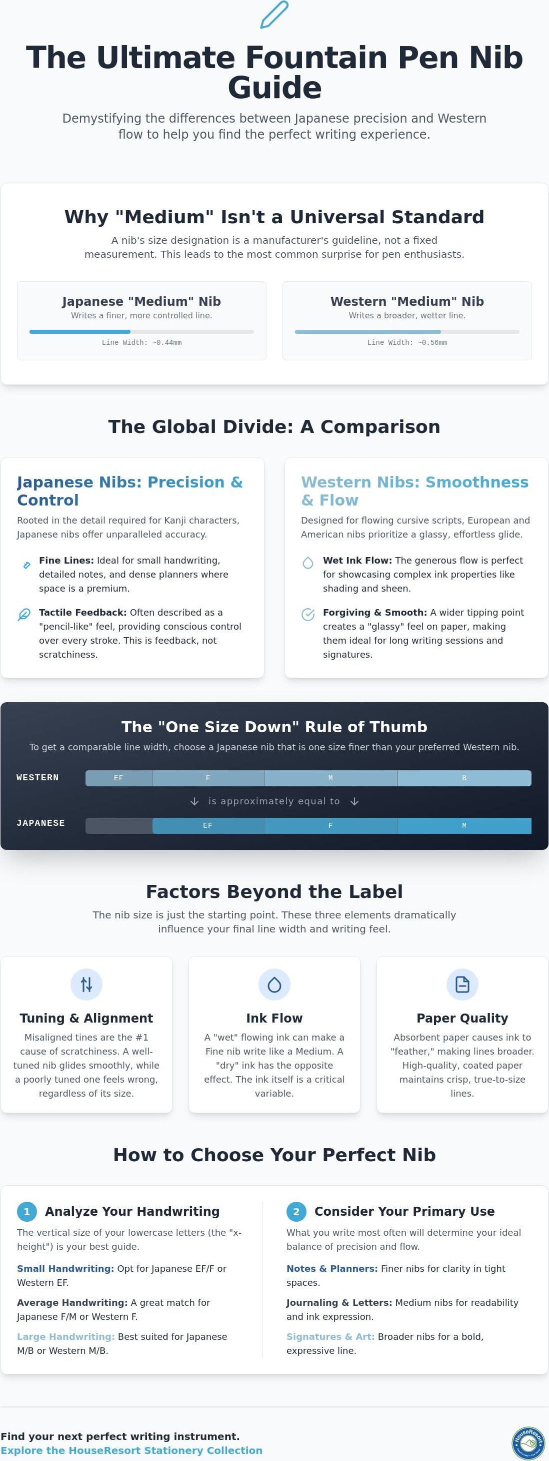
The most significant hurdle in any fountain pen nib size comparison is the regional divide between Eastern and Western manufacturing. If you've ever purchased a Japanese Medium only to find it writes like a Western Fine, you've experienced the "One Size Down" rule. This discrepancy isn't a flaw. It's a reflection of linguistic heritage. Japanese characters, or Kanji, require immense precision and thin strokes to remain legible in small spaces. Western scripts, by contrast, often favor the flowing, connected lines of cursive, which benefit from a broader, wetter delivery.
Understanding the nuances of Japanese and Western nib widths is essential for any collector. While Western brands like Lamy or Pelikan might offer a smoother, "glassy" feel, Japanese makers provide a distinct level of control. These heritage brands maintain tight manufacturing tolerances, yet each nib still possesses a unique character. For a deeper look into the history of these manufacturers, our Japanese stationery online store guide explores the tools that define modern analog collections.
The Japanese Precision Approach
Japanese Extra Fine and Fine nibs are the undisputed gold standard for users with small handwriting or those using high-density planners. Brands like Sailor and Platinum are famous for their "feedback." This isn't scratchiness. It's a deliberate tactile response similar to a sharp pencil on quality paper. This precision makes Japanese nibs the primary choice for intricate journaling and technical notations where every millimeter of space matters. If you prioritize control over sheer speed, the Japanese point is your ideal companion.
Western Heritage and Flow
German manufacturers, including Lamy and Kaweco, prioritize a "smooth and wet" writing philosophy. A Western Medium nib is often the best canvas for showcasing complex ink properties like shading and sheen. These nibs typically have a larger "sweet spot," making them more forgiving for those who vary their grip angle. While they lack the surgical precision of their Japanese counterparts, they offer a lush, effortless experience that turns daily writing into a moment of indulgence. You'll find these nibs are perfect for long-form letters where the ink's personality can truly shine. If you're ready to find your next daily writer, explore our curated selection of fine fountain pens to experience these differences firsthand.
Beyond the Chart: How Ink Flow and Capillary Action Dictate Line Width
A static chart only tells half the story. While a fountain pen nib size comparison provides a baseline, the actual line you see on the page is a product of fluid dynamics. Capillary action is the force that pulls ink from the reservoir, through the feed, and down the nib slit to the paper. The width of that slit dictates the "wetness" of the pen. If the tines are set slightly apart, the ink flow increases, which can make a Fine nib perform like a Medium. Conversely, tightly pressed tines restrict flow, resulting in a drier, thinner line that might feel scratchy regardless of the tipping size.
Ink consumption is directly tied to this flow. Broad nibs are thirsty; they lay down a lush pool of ink that takes longer to dry but showcases the true color of your choice. The lubricity of your ink also changes your perception of size. High-lubricity options, such as those found in our Pilot Iroshizuku bottled ink guide, reduce friction and allow the nib to glide. This "wet" ink can make a Fine nib feel broader and smoother. If you find a Broad nib too unruly, switching to a "dry" ink can effectively tame the line width back toward a Medium. For a foundational look at these categories, a standard fountain pen nib width comparison helps establish how these variables interact with your handwriting.
The Role of the Feed
The feed is the unsung hero of consistent writing. It sits directly beneath the nib, using a series of fins to regulate ink flow and air exchange. If you examine your nib through a jeweler's loupe, you can identify the slit shape. A "Grand Canyon" shape, where the slit is wider at the breather hole than the tip, often leads to flow issues. An "Inverted V" can cause the pen to write too wet. Feed saturation also plays a role; a pen that has been sitting nib-down will often produce a much broader first stroke than one stored horizontally.
External Factors: Paper and Humidity
Your choice of stationery is the final arbiter of line width. Absorbent, low-quality paper acts like a sponge, pulling more ink out of the nib than intended. This causes "line spread," where a Fine nib looks like a Broad, and "feathering," where the ink bleeds into the paper fibers like a spiderweb. This phenomenon is why broad nibs are often frustrating to use on standard office paper. Premium, fountain pen friendly stationery is designed to resist this absorption. It allows the ink to sit on the surface, preserving the crisp edges of your letters and providing the only accurate environment for a fountain pen nib size comparison.
A Curator’s Framework: Matching Nib Size to Handwriting Style
Choosing a nib shouldn't be a game of chance. To find your ideal match, use the "X-Height" diagnostic. Measure the vertical height of your lowercase letters, such as an "x" or an "o," in your natural script. If your x-height is consistently under 2mm, a Western Medium will likely cause your letters to "fill in," turning a legible "e" into a solid blob of ink. A precise fountain pen nib size comparison reveals that your handwriting scale is the most reliable predictor of long-term satisfaction. For those who prioritize utility in planners and narrow margin notes, Extra Fine remains the undisputed primary choice.
If you prefer expressive correspondence, Broad and Stub nibs offer the necessary surface area to showcase luxury inks. These wider points allow the ink to pool slightly, revealing the complex shading and sheen that define high-end bottled colors. A Traveler's Notebook provides the perfect modular canvas for testing these variations. Its high-quality paper inserts handle the increased ink volume of a Broad nib without the frustration of bleed-through or feathering.
The Small Script Strategy
Small, meticulous handwriting requires the surgical precision of Japanese Fine nibs. These points are engineered to keep tight loops and intersections clear, ensuring that your journal entries remain legible years later. Maintenance is a factor here. Fine channels can occasionally trap paper fibers, so I recommend keeping 0.001-inch brass shims on your desk to gently clear the nib slit. Brands like Sailor and Platinum are the benchmarks for this category. They offer a level of control that Western manufacturers rarely replicate at such a diminutive scale.
The Bold and Expressive Choice
Broad and Music nibs are the tools of choice for signatures, headers, and formal letters. These nibs maximize the "sheen" of premium fountain pen inks, creating a metallic or multi-tonal effect as the ink dries on the paper surface. If you find yourself caught between two worlds, the "Medium-Fine" (MF) nib is the ultimate versatile compromise. It offers enough precision for daily tasks while retaining enough wetness to enjoy the character of your ink. This specific size is a favorite among enthusiasts who want a single pen that can handle both a planner and a long-form letter. To find the point that best complements your personal script, browse our curated selection of heritage pens from the world's most respected makers.
From Selection to Perfection: Maintaining and Tuning Your Ideal Nib
Acquiring the correct width through a fountain pen nib size comparison is the foundation of a great writing experience, but maintenance ensures that experience lasts a lifetime. Even the most prestigious heritage pens can occasionally arrive with tines that shifted during transit. I follow the "Alignment First" rule; approximately 90% of dissatisfaction with a nib's size or feel stems from simple misalignment rather than the tipping itself. A nib that is perfectly aligned will glide, while one with even a microscopic offset will snag on paper fibers and feel unnecessarily scratchy.
Before you consider grinding a nib or adjusting its flow, you must practice on "sacrificial" pens. These are inexpensive steel-nibbed instruments that allow you to develop a feel for metal tension without risking a luxury gold nib. Environmental factors, such as high humidity or changes in air pressure during travel, can also influence how your selected size performs over time. A well-chosen and tuned pen isn't just a tool. It's a lifetime companion that adapts to your hand as you continue your analog journey.
Diagnostic Inspection
A 10x or 20x jeweler's loupe is an essential tool for any serious collector. This magnification allows you to verify that the tines are perfectly level. You can perform a "Dry Stroke" test by moving the uninked pen across the paper in various directions. If the pen catches when moving to the left but not the right, the left tine is likely sitting lower than the right. It's a common mistake to assume a nib is "too fine" when it's actually just misaligned. True scratchiness is almost always a mechanical issue, not a size characteristic.
When to Seek a Nibmeister
While basic alignment is a skill you can master, some issues require a professional nibmeister. If you notice structural damage, such as bent tines from a drop or a cracked feed, avoid DIY repairs. Professional restoration is especially vital for heirloom or vintage pens where the materials are no longer in production. You should also recognize the difference between a defect and a design signature. For example, the famous "pencil-like" feedback of a Sailor nib is an intentional choice by the manufacturer. It provides a tactile connection to the page that many connoisseurs prefer over a glassy, frictionless feel. Understanding these nuances helps you distinguish between a pen that needs tuning and one that is performing exactly as its creator intended.
Refining Your Personal Writing Experience
Mastering the nuances of tipping geometry and regional manufacturing standards transforms a simple writing tool into a seamless extension of your thoughts. You now understand that a successful fountain pen nib size comparison involves more than just a chart; it requires a synergy of ink flow, paper quality, and precise tine alignment. Whether you prioritize the surgical precision of a Japanese Fine for your daily planner or the lush, expressive strokes of a Western Broad for formal correspondence, the right nib is the foundation of your analog journey.
As an authorized retailer of heritage brands, we've done the hard work of filtering the market to present only the finest options. Our boutique is curated by analog enthusiasts who value the tactile nature of quality materials. We offer national shipping across the United States to ensure your next favorite pen arrives safely at your door. Explore our curated collection of fine fountain pens and professional stationery to find the instrument that perfectly complements your unique handwriting style. Your perfect analog escape is just a few strokes away.
Frequently Asked Questions
Is a Japanese Fine the same as a Western Extra Fine?
Generally, yes. Japanese nibs from makers like Sailor, Pilot, and Platinum run approximately one size finer than Western counterparts like Lamy or Pelikan. A Japanese Fine produces a line width similar to a Western Extra Fine due to the precision required for complex Kanji characters. This is a crucial distinction in any fountain pen nib size comparison for those switching between regional manufacturers to ensure script legibility.
How do I know if my nib is misaligned or just needs smoothing?
Use a jeweler's loupe to inspect the tines before attempting any changes. If one tine is physically higher than the other, the nib is misaligned and will feel scratchy in one specific direction. Smoothing should only be considered if the tines are perfectly level but still feel rough. Smoothing a misaligned nib often results in a "flat spot" that permanently ruins the tipping geometry and ink flow.
Can I use a brown paper bag to smooth my fountain pen nib?
Yes, a brown paper bag acts as an extremely mild abrasive for very light smoothing. It won't remove significant material, making it a safe starting point for beginners. Simply draw figure-eights on the paper for a few minutes to polish the tipping. However, it won't fix structural issues or significant scratchiness caused by poor manufacturing. Always ensure your tines are perfectly aligned before using any abrasive surface.
What is the best nib size for a beginner?
A Medium or Fine nib is typically the best entry point for new enthusiasts. Medium nibs are generally smoother and more forgiving of varied grip angles, while Fine nibs work better on standard office paper. If you primarily use high-quality journals, a Medium nib showcases the ink's character more effectively. Most writers eventually find their preference through a direct fountain pen nib size comparison in their own daily planners.
Will tuning my nib void the manufacturer's warranty?
Yes, any physical modification like grinding or aggressive smoothing usually voids the warranty. Most manufacturers only cover defects in materials and workmanship. If you're uncomfortable with the risk, it's better to send the pen to an authorized service center or a professional nibmeister. Always check the specific terms provided by heritage makers before attempting adjustments. Minor alignment changes are often acceptable, but material removal is a permanent modification.
Why does my Medium nib write differently with different inks?
Ink viscosity and lubricity significantly impact your perceived line width. A "wet" ink flows more freely, which can make a Medium nib look like a Broad on the page. Conversely, a "dry" ink restricts flow, resulting in a thinner and tighter line. The interaction between the ink's chemical composition and the nib's slit width is just as important as the physical tipping size when evaluating performance.
What should I do if I accidentally made my pen too scratchy while tuning?
Stop immediately and re-examine the tines under high magnification. You've likely misaligned the tines during the tuning process or created a sharp edge on the tipping material. Don't attempt more aggressive smoothing to "fix" the issue, as you'll likely remove too much iridium. At this stage, seeking a professional nibmeister is the safest way to restore the pen's original performance without causing further structural damage to the tines.
Can I change my nib size after purchasing the pen?
It depends entirely on the pen model. Many modern brands like Lamy or Kaweco use friction-fit or threaded nib units that are easily swappable at home. However, heritage pens with integrated or gold nibs often require professional service or a complete replacement of the section. Always verify if your specific model supports modular nib units before attempting a removal to avoid damaging the feed or the internal housing.