
How to Swatch Fountain Pen Inks Effectively: A Connoisseur’s Guide
A bottle of fountain pen ink is a dormant masterpiece, but a poorly executed swatch is a disservice to the maker's craft. You've likely felt the frustration of seeing a vibrant, multi-tonal ink online only to have it look flat or muddy in your own notebook. Wasting expensive ink on inconsistent tests is a common pain for collectors who value precision. Learning how to swatch fountain pen inks effectively is the only way to bridge the gap between a glass bottle and a functional, beautiful ink library.
We understand that swatching is more than just a chore; it's a ritual of appreciation for the analog experience. This guide will help you master the professional techniques and specialized tools required to capture the true soul of every pigment. You'll discover how to create a professional-looking catalog that accurately reflects sheen, shading, and shimmer. We'll explore the necessity of high-quality substrates like Sanzen Tomoe River paper and Rhodia notepads, ensuring your workflow is both repeatable and efficient. From selecting the right Col-o-ring cards to perfecting your application, your journey toward a curated ink collection starts here.
Key Takeaways
- Understand why printed bottle labels are often misleading and how to create technical swatches that accurately record saturation, flow, and dry times.
- Discover how to swatch fountain pen inks effectively by balancing the convenience of disposable swabs with the precision of professional-grade reusable application tools.
- Identify how paper sizing and weight influence the visibility of sheen and shading while preventing common issues like ink bleed-through and ghosting.
- Master advanced application methods, including the 'Double-Dip' technique, to capture the full gradient of an ink's personality and ensure even shimmer distribution.
- Develop a sophisticated indexing strategy to organize your ink library by brand, color family, or property for a more efficient and inspired writing ritual.
The Purpose of Effective Ink Swatching: Beyond Simple Color
A true connoisseur views their ink collection not as a random assortment of bottles, but as a meticulously curated library. Swatching is the technical audit that brings order to this inventory. While many beginners see swatching as a simple aesthetic exercise, experienced enthusiasts use it as a vital reference for saturation, flow, and dry times. Understanding Fountain pen ink composition is the first step in realizing that liquid dyes behave differently depending on concentration and chemical additives. By treating each bottle with the respect a fine tool deserves, you transform a hobby into a professional-grade archive.
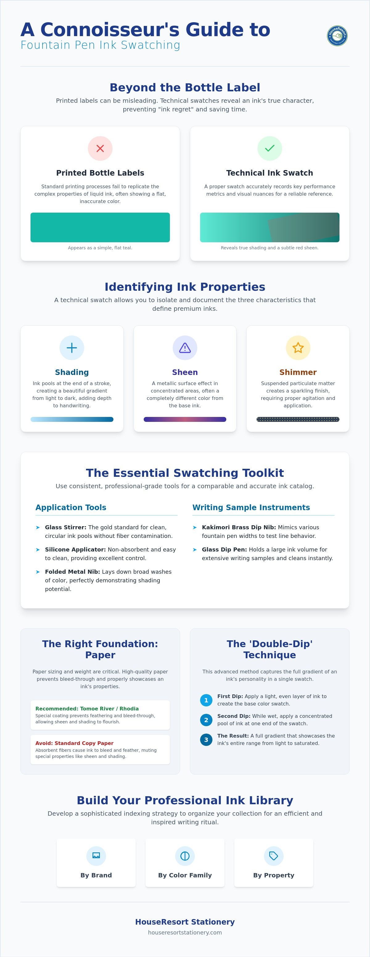
Relying on bottle labels is a frequent mistake that leads to disappointment. Most labels are produced using standard printing processes that cannot replicate the complexity of liquid ink. A label might suggest a vibrant teal, but the actual ink may lean toward a muted forest green once it hits the page. Learning how to swatch fountain pen inks effectively helps you eliminate 'ink regret' before you ever ink up a precious heirloom pen. It's much better to discover a dry flow or an unexpected undertone on a reference card than to spend twenty minutes cleaning a stubborn nib. This proactive approach saves time and preserves the integrity of your writing instruments.
Visual vs. Functional Swatching
Effective swatching requires a dual approach that balances art with utility. Visual swatches focus on the artistic personality of the ink, often using heavy application to reveal chromatography and the way pigments separate into hidden hues. Functional swatches, however, test how the ink behaves in a standard nib. A professional reference card should include both a large, saturated area and a few lines of actual writing. This combination tells you if an ink that looks stunning in a large splash will actually be legible during a long journaling session or if it's too light for professional correspondence.
Identifying Ink Properties
Technical swatching allows you to isolate three primary characteristics that define premium inks. Identifying these correctly is essential for any boutique-style library:
- Shading: This occurs when ink pools at the end of a stroke, creating a beautiful gradient from light to dark. It adds depth to your handwriting that no ballpoint can replicate.
- Sheen: A metallic surface effect that appears in areas of high dye concentration. It often shows a color completely different from the base ink, such as a green sheen on a deep purple base.
- Shimmer: This involves the suspension of particulate matter for a sparkling finish. It requires specific application techniques to ensure the particles don't settle at the bottom of the bottle before swatching.
Curating Your Essential Ink Swatching Toolkit
Precision in your ink library begins with the physical tools on your desk. Mastering how to swatch fountain pen inks effectively requires a shift from disposable convenience to professional-grade precision. While many enthusiasts start with cotton swabs, these tools are often porous and inconsistent. They absorb a significant amount of ink, which can diminish the visible sheen and trap particulate matter in shimmer inks. To build a truly comparable catalog, you must use a consistent set of high-quality application instruments that allow the ink's true chemistry to shine.
Application Tools for Large Swatches
For the primary color block, professional tools offer superior control over pooling and saturation. A glass cocktail stirrer is the gold standard for creating clean, circular pools of ink without the risk of fiber contamination. If you prefer a modern approach, silicone makeup applicators provide a non-absorbent surface that is exceptionally easy to clean between colors. For those who want to see a full range of saturation in a single stroke, a folded metal nib allows you to lay down broad washes of color that beautifully demonstrate an ink's shading potential.
Writing Sample Instruments
A swatch card is incomplete without a demonstration of how the ink performs under a nib. Kakimori brass dip nibs are a favorite among collectors because they can mimic various fountain pen widths depending on the angle of use. This versatility allows you to see how an ink behaves in both a fine and a broad line without changing tools. A glass dip pen is the most efficient testing tool because its grooved nib holds a significant volume of ink for writing samples while cleaning instantly with a simple water rinse.
Maintenance and Cleaning Essentials
Maintenance requires a disciplined cleaning station to prevent cross-contamination between colors. A two-cup water system is essential; use the first cup for the initial rinse and the second for a final polish. Always use lint-free cloths to dry your nibs, as standard paper towels can leave micro-fibers that snag in delicate tines. Managing excess moisture is equally important for accuracy. Utilizing blotting paper sheets ensures that your swatches dry crisp and clear without accidental smudging or feathering. This methodical approach ensures that every entry in your library is a true technical record. If you are looking to expand your collection, our curated selection of fine writing instruments offers the perfect companions for your newly swatched inks.
Selecting the Right Paper for Accurate Ink Representation
Choosing the right substrate is just as critical as the ink itself. If you want to know how to swatch fountain pen inks effectively, you must understand that the paper is a chemical participant in the final result. Most standard office papers are designed to absorb ink quickly to prevent smearing; unfortunately, this kills the vibrant properties of fountain pen inks. Professional-grade papers use a process called "sizing," a surface coating that keeps the ink sitting on top of the fibers. This delay in absorption allows dyes to pool and dry slowly, which is the exact mechanism that creates shading and metallic sheen.
Paper weight, measured in grams per square meter (gsm), also plays a role, though it's a common misconception that heavier paper is always better. While a higher gsm often prevents bleed-through, the surface treatment is what truly stops "feathering," where ink spreads like a spiderweb across the page. For a connoisseur, Japanese stationery remains the undisputed benchmark for these technical tests. These manufacturers prioritize the tactile relationship between nib and sheet, ensuring that every shimmer particle and chromatic shift is preserved with accuracy.
The Best Papers for Sheen and Shading
Sanzen Tomoe River paper is the gold standard for enthusiasts. Its unique coating is incredibly thin yet resilient, allowing inks to pool significantly without soaking through. This makes it the best choice for revealing "monster sheen" and complex chromashading. Midori MD paper offers a different experience; its slight "tooth" or texture provides a more tactile writing feel and a more honest representation of how ink behaves in a daily journal. For those who prefer a warmer aesthetic, Life Noble Note provides a cream-colored base that adds a vintage elegance to your swatches, though it may slightly alter the perceived hue of lighter blues and greens.
Format: Cards vs. Notebooks
The format of your library depends on your personal organizational style. Ink cards, such as the Col-o-ring system, offer unparalleled flexibility. You can rearrange them by color family, brand, or property, making it easy to compare three different shades of navy side-by-side. Dedicated ink journals, on the other hand, provide a beautiful chronological history of your collection. They act as a diary of your evolving tastes. Many collectors find that using both cards for quick comparison and a notebook for a permanent record is the most effective way to manage a growing archive.
Master Techniques for Swatching Sheen, Shading, and Shimmer
Technical mastery is what separates a cluttered drawer of scribbles from a professional-grade ink library. To understand how to swatch fountain pen inks effectively, you must learn to manipulate the ink to reveal its full range of properties. This involves a deliberate balance between aesthetic "splashes" and functional writing samples. By using specific methods like the 'Double-Dip' technique, you can create a gradient on a single card that shows how the color behaves at three different levels of saturation. This record becomes an invaluable tool when you are deciding which ink to pair with a specific pen and nib width.
Shimmer inks require additional care to ensure the particulate matter is evenly represented. If the particles are not properly suspended, your swatch will either look overly glittery or completely flat. A successful smear test is also vital for the modern writer. By dragging a finger or a clean tool across a drying sample at set intervals, you can accurately record dry times and smudge resistance. This functional data is just as important as the color itself, especially for left-handed writers or those using non-absorbent Japanese papers.
The Step-by-Step Swatch Process
Consistency is the foundation of a reliable reference system. Follow this methodical workflow for every new bottle in your collection:
- Step 1: Agitation. Gently roll the bottle between your palms. This incorporates settled dyes and shimmer particles without creating air bubbles that can interfere with the pool.
- Step 2: The Pool. Apply a heavy concentrated area of ink using a glass rod or a silicone applicator. This "pool" is where you will see the most dramatic sheen and chromatography.
- Step 3: The Writing Sample. Use a glass pen to write the ink name and a few lines of text. This represents the "real world" color you will see during daily use.
- Step 4: The Water Drop Test. Once the swatch is fully dry, apply a single drop of water to a corner. This reveals the ink's resilience and whether the base dyes will remain legible after a spill.
Specific Tips for Specialty Inks
Different ink chemistries require unique approaches. To maximize sheen, apply heavy saturation on a non-absorbent substrate; the longer the ink takes to dry, the more the metallic surface effect will develop. When testing Pilot Iroshizuku bottled ink, focus on its legendary shading. These inks are formulated for exceptional flow, so a lighter application often reveals more character than a heavy splash. Finally, if you are swatching iron gall or permanent inks, implement immediate cleaning protocols. These formulas can be corrosive or staining if left to dry on your glass pens or brass nibs. If you are ready to start your next swatching session, explore our collection of premium inks and accessories to find your next favorite shade.
Building and Indexing Your Professional Ink Library
Once you have mastered the technical application, the final stage is creating a retrieval system that serves your creative process. Learning how to swatch fountain pen inks effectively is only half the battle; the other half is building an index that remains functional as your collection grows. A pile of loose cards is a missed opportunity for inspiration. A curated library, however, allows you to compare subtle tonal shifts across different brands with a single glance. This curatorial act transforms a simple hobby into a sophisticated archive of color and chemistry.
Lighting is a critical, often overlooked factor in this process. Always review your finished swatches under both natural daylight and warm artificial light. Sheen properties that are invisible under a standard office lamp might glow brilliantly near a window. To ensure you always have your collection at hand, consider digital indexing. High-resolution photography allows you to carry your library in your pocket while shopping for new additions. This physical record also serves as a wonderful foundation for fountain pen doodle journaling. Using your technical swatches as a color palette for daily creative sketches turns a dry record into a source of daily inspiration.
Labeling and Data Points
Consistency in labeling is paramount for long-term comparison. Every card or page should follow a set layout to ensure your eye knows exactly where to find technical data. Essential information includes the manufacturer, the specific ink name, and the date the swatch was created. You should also record the pen and nib width used for the writing sample, along with the specific paper type. If you want to be truly thorough, add optional ratings for dry time and water resistance. This level of detail helps you understand how to swatch fountain pen inks effectively for your specific writing needs.
Storage Solutions for Ink Swatches
Protecting your work is the final step in maintaining an accurate library. Many dye-based inks are sensitive to UV light and will fade if left exposed on a desk. Business card binders are an excellent solution; they allow for easy flipping and quick color matching while keeping the cards flat and protected. For those who prefer a more tactile, boutique aesthetic, custom-made wooden boxes offer a beautiful way to display your collection. Regardless of the storage method, keeping your swatches in a cool, dark environment ensures the colors remain as vibrant as the day they were first bottled.
Cultivating Your Personal Ink Legacy
Mastering how to swatch fountain pen inks effectively transforms your collection from a hidden stash into a professional technical library. By choosing the right substrates like Sanzen Tomoe River paper and utilizing precision tools like glass dip pens, you ensure every entry is a faithful record of color and chemistry. This disciplined approach eliminates the guesswork from your writing ritual. It allows you to predict exactly how a high-sheen or shading ink will perform in your favorite pen before you ever fill the converter.
As an authorized retailer of heritage brands like Pilot, Lamy, and Sailor, we understand the tactile joy of quality materials. We specialize in high-sheen and shading inks that demand the professional swatching techniques we've discussed. Explore our curated selection of fine fountain pen inks and premium paper at HouseResort Stationery to find your next masterpiece. We offer nationwide shipping on all premium stationery to support your growing archive. Your journey into the deeper nuances of ink is just beginning; enjoy every drop of the process.
Frequently Asked Questions
What is the best paper for swatching fountain pen inks?
Sanzen Tomoe River 52gsm is the industry benchmark for revealing an ink's full character. This paper's specialized sizing prevents the ink from absorbing too quickly, allowing for maximum sheen and shading. Rhodia notepads, such as the No. 16 or No. 18, offer a reliable, smoother alternative for those who prefer a brighter white background and slightly faster drying times during the testing process.
How do I see the sheen in my fountain pen ink swatches?
Achieving visible sheen requires heavy ink saturation on a non-absorbent substrate. Use a glass stirrer or a silicone applicator to create a concentrated "pool" of ink. As the dyes dry slowly on the surface of papers like Midori MD or Tomoe River, the metallic surface effect will crystallize. This is a key part of learning how to swatch fountain pen inks effectively for high-sheen collections.
Can I use regular printer paper for ink swatching?
Standard printer paper is generally unsuitable for effective swatching because it lacks the necessary surface sizing. Most copy paper is designed to be highly absorbent to prevent inkjet smearing, which causes fountain pen ink to "feather" and bleed through the sheet. This absorption kills the shading and sheen properties, providing an inaccurate representation of a premium ink's true potential.
Do I need a glass dip pen to swatch inks effectively?
While not strictly mandatory, a glass dip pen is the most efficient instrument for creating consistent writing samples. Its grooved surface holds enough ink for several lines of text and rinses clean in seconds. Alternatively, Kakimori brass dip nibs are excellent for simulating different fountain pen widths, though they require a bit more maintenance and a dedicated nib holder than a solid glass pen.
How do I clean my swatching tools between different colors?
A two-cup water system is the professional standard for preventing cross-contamination between entries. Use the first vessel to remove the bulk of the pigment and the second for a final, clear rinse. Always dry your tools with a lint-free cloth rather than a paper towel to avoid leaving micro-fibers that can clog the tines of your dip nibs or interfere with the ink's capillary action.
Is it better to organize ink swatches by brand or by color?
Organization depends on whether you shop by manufacturer or by aesthetic hue. Many connoisseurs prefer organizing by color family to make it easier to find the perfect shade for a specific project. Utilizing a card system like the Col-o-ring allows you to rearrange your library as it expands, giving you the flexibility to group by brand for technical comparison or by color for creative inspiration.
Why does my ink look different in a swatch than it does in my pen?
The difference usually stems from the "wetness" of your pen's feed and the width of its nib. A swatch often represents a maximum saturation level that a fine or dry nib cannot replicate. Understanding how to swatch fountain pen inks effectively involves including a writing sample with a dip pen, which more closely mimics the actual flow of a fountain pen than a heavy, concentrated ink splash does.
How can I prevent my ink swatches from fading over time?
Protecting your swatches from ultraviolet light is the most effective way to prevent dye degradation. Most fountain pen inks are not lightfast and will shift or fade if left in direct sunlight for extended periods. Store your cards in business card binders or custom wooden boxes to ensure they remain in a dark, climate-controlled environment, preserving the color accuracy of your library for years to come.