
Journaling Doodle Ideas for 2026: A Creative Guide for Stationery Enthusiasts
What if the most sophisticated additions to your 2026 planner didn't require a single formal art lesson? Many collectors hesitate to decorate their pages because they fear ruining expensive Tomoe River or Midori MD paper with a misplaced stroke or a smudge of wet ink. It is a common frustration to feel like your artistic talent hasn't quite caught up to your deep appreciation for fine stationery. This guide introduces approachable journaling doodle ideas specifically designed to complement the flow of a fountain pen rather than fight against it.
You deserve to feel the tactile satisfaction of seeing your favorite shading inks come to life through more than just lines of text. We will show you how to transform your layouts using simple, professional shapes that highlight the craftsmanship of your tools without the risk of bleeding or feathering. You will learn to create minimalist botanical accents, structured geometric headers, and techniques to use your existing ink collection for a beautiful, personalized analog experience.
Key Takeaways
- Understand the role of mindful doodling as a low-stakes creative practice that facilitates a complete analog escape from digital fatigue.
- Learn why selecting fountain pen friendly paper is the critical foundation for preventing feathering and preserving the integrity of your drawings.
- Access a visual library of 15 sophisticated journaling doodle ideas, including minimalist eucalyptus and geometric headers designed for high-end stationery.
- Discover how to leverage technical ink properties like shading and sheen to create professional gradients and metallic effects with a single stroke.
- Master functional layout techniques to integrate these illustrations into your daily planner without overcrowding your essential notes.
Why Journaling Doodles are the Ultimate Analog Escape in 2026
The digital saturation of recent years has led to a deliberate return to paper. In 2026, the "Analog Escape" is a wellness strategy. Journalers choose the friction of a nib on paper over the glow of a tablet. This shift prioritizes the tactile experience of using fine stationery. It's a way to reclaim focus in a world designed for distraction. By putting pen to paper, you create a private space that belongs only to you.
Doodling serves as the bridge between functional planning and creative expression. While the history of doodling suggests it was once seen as a sign of distraction, we now recognize it as a tool for cognitive focus. It's a low-stakes, mindful practice. You don't need a finished masterpiece. You just need the rhythm of the pen moving across a page. This process allows your mind to wander while your hand remains grounded in the present moment.
The psychological benefits are rooted in the repetitive nature of the strokes. Drawing small, consistent patterns can lower cortisol levels and improve information retention. It's about the process. When you explore journaling doodle ideas, the goal is to engage with your ink and paper, not to fill a gallery. This rhythmic movement acts as a form of "active meditation" that relieves stress more effectively than passive scrolling ever could.
Doodling vs. Illustration: Lowering the Stakes
A curator knows that character often lies in imperfection. Unlike formal illustration, doodling doesn't demand perfect perspective or anatomical accuracy. It uses basic geometric foundations like circles, triangles, and lines. These simple shapes act as the building blocks for more complex-looking designs. By lowering the stakes, you remove the "I can't draw" barrier that stops many enthusiasts from personalizing their notebooks. Simple shapes are often more effective for daily journaling because they don't overwhelm the text or require hours of dedicated time.
The 2026 Aesthetic: Minimalist and Vintage
The current trend has moved away from the bright neon and "kawaii" styles of the past decade. We're seeing a resurgence of heritage tones: sepia, forest green, and deep burgundy. These colors pair beautifully with the cream-colored pages of a Hobonichi or the rugged leather of a Traveler’s Notebook. Use your journaling doodle ideas to create subtle accents that honor the structured layout of your planner. The Modern Analog Aesthetic is a curated blend of traditional craftsmanship and personal, hand-drawn expression.
The Enthusiast’s Toolkit: Selecting Pens and Paper for Doodling
The foundation of any creative practice lies in the quality of the materials. When you explore journaling doodle ideas, the interaction between your nib and the page determines the success of every stroke. Using fountain pen friendly paper is a non-negotiable requirement. Standard office paper often leads to feathering, where ink spreads into the fibers like a spiderweb. This ruins the crisp lines required for sophisticated, minimalist doodles. High-quality paper allows you to experience the thinking benefits of doodling without technical frustration.
Each surface offers a unique form of tactile feedback. Some papers are smooth and glassy, while others provide a slight resistance. This physical sensation is part of the allure for the collector. The weight of the paper and the size of your nib also play significant roles. An Extra Fine nib provides surgical precision for intricate botanical stems. A Broad nib creates bold, authoritative borders. Finding the right balance between these elements transforms a simple drawing into a professional-looking illustration.
Paper Selection: Midori MD vs. Traveler’s Notebook
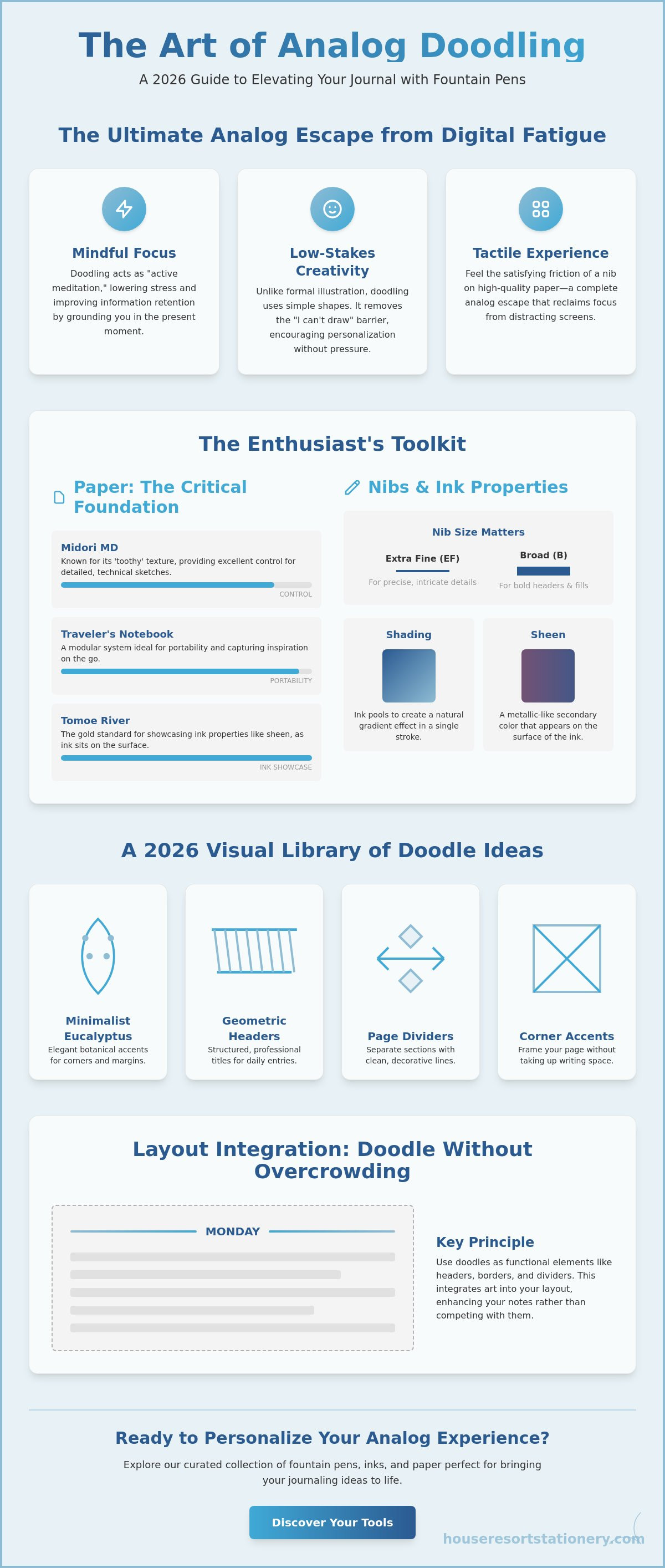
Midori MD paper is celebrated for its toothy texture. This slight friction provides control for detailed, technical sketching. It is a favorite for those who value precision over speed. Conversely, the traveler's notebook offers a modular system. It is built for portability and on-the-go creativity. You can swap inserts based on your needs, making it the ideal companion for capturing fleeting inspirations. For doodles that occupy larger areas, Tomoe River paper remains the gold standard. Its unique coating allows fountain pen ink to sit on the surface, showcasing "sheen," the metallic-like secondary color found in premium inks.
Pens and Pencils: From Blackwing to Sailors
Precision begins before the ink hits the page. The blackwing 602 pencils are the gold standard for initial pencil sketches. Their firm graphite allows for light guidelines that erase cleanly without damaging the paper surface. Once your layout is set, the choice of fountain pen nib changes the character of your work. Brands like Sailor are prized for their consistent ink flow. This reliability is vital for long, unbroken lines in geometric patterns. Tools found in a Japanese stationery online store guide, such as fineliners, offer varied line weights for borders and headers. You can view our full selection of premium tools to find the perfect match for your aesthetic.
Curated Journaling Doodle Ideas: A 2026 Visual Library
Practical application begins with a curated library of forms. Implementing sophisticated journaling doodle ideas doesn't require complex sketches. It requires a focus on clean lines and intentional placement. When you use the best pens for writing and sketching, the ink flow allows for effortless execution of these motifs. The following library focuses on themes that resonate with the modern collector: nature, celestial bodies, and the heritage of stationery itself.
Botanical and Organic Shapes
Botanical elements are the most versatile additions to any layout. For 2026, the focus is on simplified eucalyptus, lavender, and feathery ferns. You can create a 15-piece botanical library by varying the leaf count and stem curvature of these three base plants. A single-line vine is an effective way to frame a page. Start at the bottom corner. Draw a continuous, slightly wobbly line upward. Add small, teardrop-shaped leaves at irregular intervals. This technique frames your text without crowding the page. Leaf clusters are perfect for filling negative space in a daily layout. Use an Extra Fine (EF) nib for cross-hatching. This adds depth to your leaves without the need for heavy shading or multiple colors. It keeps the aesthetic clean and professional.
Minimalist Headers and Frames
Headers should provide structure, not distraction. Banner doodles are a classic choice. Draw two parallel horizontal lines. Connect them with short vertical strokes. Add a small "V" notch at the ends to create a ribbon effect. This highlights your titles while maintaining a minimalist look. Divider lines are equally important. Instead of a solid line, use a series of dots and dashes. This creates a sophisticated, airy feel. You can also use the "Box and Shadow" technique for important notes. Draw a simple rectangle around your text. Add a thin, secondary line along the bottom and right edges. This creates a subtle 3D effect that makes the note pop. It's a functional way to organize information visually.
Many of these structured geometric patterns draw inspiration from timeless design movements. Just as the curated collections at Attica House showcase the bold lines and symmetry of Art Deco, your journaling can reflect a similar balance of luxury and simplicity through intentional, geometric framing.
Beyond plants and borders, consider these recurring motifs for a personalized touch:
- Celestial Themes: Crescent moons, simple constellations, and clusters of "stardust" dots.
- Vintage Stationery Icons: Stylized ink bottles, fountain pen nibs, and circular wax seals.
- Travel-Inspired Motifs: Minimalist compasses, three-peak mountain ranges, and vintage suitcases.
These icons act as visual shorthand for your experiences. A tiny lightbulb can mark a new idea. A small mountain range might denote a weekend trip. By using consistent symbols, you develop a personal visual language. This makes your journal a cohesive record of your year. The goal is to enhance the page, allowing your high-quality ink and paper to remain the primary focus.
Ink Play: Leveraging Fountain Pen Properties in Your Doodles
The true magic of the analog experience lies in the chemistry of the ink. While fineliners offer consistency, fountain pens provide character through technical properties like shading and sheen. Shading is the phenomenon where ink pools at the end of a stroke, creating a natural gradient from light to dark. This allows you to add dimension to your journaling doodle ideas without switching pens. By varying your writing speed and the pressure applied to the nib, you can coax multiple tones from a single reservoir of ink.
Sheen is a more specialized trait found in highly saturated boutique inks. It occurs when the ink sits on top of non-absorbent paper rather than soaking in, revealing a metallic flash of a secondary color. For those exploring fountain pen doodle journaling for beginners, a simple way to start is through "ink swatching." Instead of a plain block of color, draw a small bottle or a cloud and fill it with a heavy layer of ink. This "puddle" technique is the most effective way to showcase the complex chromatography and hidden colors within your collection.
Mastering Shading and Sheen
Selecting the right ink is as important as the drawing technique itself. We recommend pilot iroshizuku bottled ink for its exceptional flow and vibrant shading properties. To highlight sheen, draw solid shapes like circles or thick leaves on Tomoe River paper. The ink will dry slowly, allowing the metallic properties to crystallize on the surface. You can also manipulate the nib dry time to your advantage. Touching a wet line with a finger or a blending stump creates an intentional smudge that serves as a soft, artistic shadow for your illustrations.
Layering Colors and Textures
Sophisticated layouts often rely on depth. Use light grey inks to create "ghost" doodles in the background before writing your daily notes over them. This layering adds visual interest without sacrificing legibility. When using multiple colors, remember a critical rule for pen health: avoid mixing different ink brands inside the pen to protect the delicate feed and nib. If you want to show off high ink saturation, use repetitive stippling. This dot-work technique allows the ink to build up in specific areas, creating a textured, professional look. You can explore our curated ink collection to find the perfect shades for your next entry.
Water-soluble inks offer another creative avenue. After drawing a simple outline, use a water brush to lightly pull the pigment into the center of the shape. This "ink wash" effect creates a watercolor appearance that perfectly complements the heritage aesthetic of a high-quality journal. It is a controlled way to add color while letting the unique properties of your fountain pen ink remain the star of the page.
Layout Inspiration: How to Integrate Doodles into Your Planner
A well-curated layout balances white space with intentional decoration. Integrating your journaling doodle ideas into a functional planner requires a strategic approach to placement. The "Corner Cluster" technique is an ideal starting point. By grouping botanical or geometric shapes in the top or bottom corners of your page, you add significant visual weight without sacrificing the central writing area. This method frames your entries and gives the page a finished, boutique appearance that feels organized rather than cluttered.
Doodles also serve a functional purpose beyond mere ornament. You can use them as specialized bullet points to categorize your notes at a glance. A tiny lightbulb signifies a new idea, while a small envelope marks a task related to correspondence. For those who track daily variables, a "Doodle of the Day" box is a helpful addition. Use this small, dedicated space to illustrate the weather or your current mood using the minimalist symbols discussed in our visual library. This creates a rhythmic, visual record of your month that is easy to review.
Layering different analog tools enhances the tactile experience of your journal. Try combining washi tape with your drawings for a multi-dimensional look. Place a strip of heritage-patterned tape along the edge of a page and draw a delicate vine or geometric border that overlaps the tape. This technique anchors the drawing and integrates the different textures of your stationery collection. It's a hallmark of the modern analog aesthetic, showing a deep appreciation for how different materials interact.
Functional Doodling for Productivity
Productivity trackers don't need to be rigid or purely textual. You can design a habit tracker using simple geometric "fill-in" doodles. Instead of checking a box, fill a tiny circle or diamond with a drop of shading ink each time you complete a task. Use connector lines, thin strokes that link disparate notes, to show the relationship between different projects or ideas. Creating a personal "Icon Key" at the front of your notebook ensures your shorthand remains consistent. This system allows for rapid logging while maintaining a sophisticated, hand-drawn feel.
Creative Journaling as a Ritual
The act of doodling is most effective when it becomes a daily ritual. Setting a five-minute "doodle timer" at the end of the day encourages reflection without the pressure of writing long paragraphs. It's a way to decompress and engage with your tools. If you find yourself with a day where there isn't much to write, use your journaling doodle ideas to fill the empty space. Large, airy botanical clusters or celestial patterns prevent the page from feeling neglected. Explore our curated selection of fine journals and notebooks to find the perfect canvas for your 2026 creative journey.
Elevate Your Analog Practice in 2026
Embracing a slower, more tactile way of life through creative expression is a powerful way to reclaim your focus. You've discovered how technical ink properties like shading and sheen can transform simple shapes into professional accents. By selecting the right foundation, such as Midori MD or Tomoe River paper, you ensure that every stroke is crisp and intentional. These journaling doodle ideas are designed to grow with your skills. They allow you to explore the unique capabilities of your specific fountain pen collection while building a beautiful, personalized record of your year. It's a practice that prioritizes the joy of the process over the pressure of perfection.
The transition from a blank page to a curated masterpiece starts with the right tools. Discover the finest journals and fountain pens for your creative practice at HouseResort Stationery. We are an authorized retailer of prestigious heritage brands like Sailor, Lamy, and Midori. Our expert-curated selection is built specifically for stationery enthusiasts who value quality and craftsmanship. With national shipping across the United States, we bring the world’s best analog tools directly to your door. Start your creative ritual today and see how a few mindful lines can change your perspective.
Frequently Asked Questions
What is the best pen for journaling doodles?
A fountain pen with an Extra Fine (EF) or Fine (F) nib is the premier choice for detailed work. These nibs provide the surgical precision needed for intricate journaling doodle ideas without overwhelming the page with too much ink. For those who prefer a consistent line weight for borders and headers, archival fineliners like the Sakura Pigma Micron are reliable alternatives that won't smudge.
Will fountain pen ink bleed through my journal if I use it for drawing?
Bleeding is prevented by matching your ink flow to a high-quality paper weight. If you use fountain pen friendly paper like Midori MD or Tomoe River, most inks will sit on the surface without soaking through to the other side. You should avoid using very wet, broad nibs on standard 80gsm copy paper, as this is where feathering and bleed-through are most likely to occur.
Do I need to be good at drawing to start a doodle journal?
Artistic talent isn't a prerequisite for starting this creative practice. Most sophisticated designs are built from basic geometric foundations like circles, triangles, and simple lines. The goal is mindful expression rather than technical perfection. By focusing on repetitive patterns like botanical stems or minimalist headers, any enthusiast can create a professional, personalized layout.
What is the best paper for showing off ink sheen in doodles?
Tomoe River paper remains the gold standard for showcasing ink sheen. Its unique surface coating prevents the ink from absorbing immediately, which allows the metallic secondary colors to crystallize as they dry on the page. Other options like Midori MD also perform well, though they tend to emphasize ink shading and tactile texture over high-gloss sheen effects.
How do I stop my doodles from smudging in my planner?
Using blotting paper is the most effective way to prevent smudging in your planner. Place a small sheet of absorbent paper between your pages before closing the notebook to catch any lingering moisture. You can also opt for faster-drying inks or finer nibs that deposit less liquid, which significantly reduces the dry time for your journaling doodle ideas.
Can I use watercolor with my fountain pen doodles?
Watercolor can be used if you first draw your outlines with waterproof or document-grade inks. If you use standard water-soluble fountain pen ink, the water will cause your lines to bleed and blur across the page. This can be used intentionally for "ink wash" effects, but for crisp illustrations, a pigment-based ink is necessary to maintain the integrity of your lines.
What are some easy things to draw for a beginner?
Beginners should start with minimalist botanical stems, celestial clusters, and geometric borders. A single line decorated with teardrop leaves or a series of dots and dashes can create a sophisticated look with very little effort. These shapes are forgiving and allow you to practice ink control while producing a result that complements your handwriting.
How do I fix a mistake in my journal doodle?
Mistakes can be elegantly hidden using washi tape or by expanding the doodle into a larger cluster. If a line goes astray, you can often turn it into a new leaf or a decorative flourish that adds character to the piece. For larger errors, a small strip of heritage-patterned tape acts as a beautiful patch that adds a layered, boutique texture to your layout.