
The Connoisseur’s Guide to Stub, Italic, and Flex Nibs
What if the secret to elegant handwriting isn't endless hours of practice, but the specific geometry of your pen's tip? Many writers eventually feel limited by a flat, monoline stroke that lacks the character of traditional calligraphy. It's common to feel intimidated by technical jargon or the fear of a scratchy, difficult writing experience. This guide to stub italic and flex nibs simplifies the transition from standard tools to specialty instruments. We believe that beautiful line variation should feel like a natural extension of your hand rather than a chore to be mastered.
You'll learn the mechanics behind how different grinds and metal flexibility create sophisticated "thick and thin" strokes. We'll demystify terms like railroading and help you identify the specific nib type that complements your natural writing speed. From the crisp edges of an italic to the expressive bounce of a flex nib, you'll gain the confidence to select a heritage piece from makers like Pilot or Lamy. Let's transform your daily writing into a tactile, rewarding ritual.
Key Takeaways
- Understand how line variation moves beyond standard "monoline" writing to add architectural character and depth to your script.
- Learn why the stub nib is the ideal entry point for enthusiasts seeking effortless thick and thin strokes with a smooth, forgiving feel.
- Master the nuances of pressure-based writing and how to distinguish between modern "soft" nibs and true vintage-style flex performance.
- Use this guide to stub italic and flex nibs to match a specialty grind to your natural writing rhythm and hand pressure.
- Identify the specific nib characteristics that suit your collection before purchasing heritage instruments from authorized curators.
Understanding Line Variation: Beyond Standard Fountain Pen Nibs
Line variation is the visual soul of sophisticated handwriting. It refers to the deliberate contrast between the thickness of vertical strokes and the thinness of horizontal ones. Most writers begin their journey with standard Extra Fine, Fine, or Medium nibs. These tools are engineered for utility. They feature a symmetrical, rounded ball of hard metal at the tip that ensures a consistent line regardless of the direction or angle of your stroke. While this "monoline" output is reliable for quick note-taking, it often lacks the expressive character found in historical manuscripts or professional calligraphy.
To move beyond the uniform stroke, writers must look toward specialty tools. This guide to stub italic and flex nibs explores how different engineering choices produce distinct visual results. There are two primary paths to achieving this variation. The first is through nib geometry, where the physical shape of the tipping material is ground into a specific silhouette. The second is through nib flexibility, where the structural properties of the metal allow the tines to spread under pressure. In both cases, the nib tines and the underlying feed must work in perfect harmony. The feed acts as the heart of the pen, regulated to maintain a consistent ink flow even as the writing surface area changes during a broad downstroke.
The Anatomy of a Specialty Nib
A standard nib uses a spherical tipping to provide a forgiving experience. In contrast, a specialty nib uses shaped tipping, often flattened or elongated, to create specific contact points with the paper. The slit and tines are the primary actors here. As you write, the slit carries ink via capillary action to the tip. Understanding Fountain Pen Nibs is essential for recognizing how these components interact. Many specialty grinds possess a "sweet spot," which is the precise angle at which the nib performs with maximum smoothness. Finding this alignment is a rewarding part of the collector's process.
Why Enthusiasts Graduate to Specialty Nibs
The transition to specialty nibs is usually driven by a desire for deeper personal expression. These nibs provide a vintage aesthetic that standard ball-tipped pens simply cannot replicate. They are also the best way to showcase the complex properties of premium bottled inks, such as shading and sheen, which often disappear in a monoline stroke. For those exploring creative outlets like fountain pen doodle journaling for beginners, a specialty nib adds immediate professional flair to even the simplest sketches. It turns every word into a deliberate piece of art.
Stub and Italic Nibs: Creating Architectural Character
Architectural line variation relies on the physical shape of the nib rather than the pressure of your hand. A stub nib is the quintessential entry point for this style. Unlike a standard round nib, a stub is ground flat with slightly rounded corners. This geometry creates a wide vertical stroke and a narrow horizontal stroke automatically as you move across the paper. It is a predictable, reliable way to add flair to your signature without learning complex calligraphic techniques or altering your natural grip.
In this guide to stub italic and flex nibs, it's vital to distinguish between the forgiving nature of a stub and the exacting precision of a formal italic. While both share a flat profile, the italic nib features sharp, crisp edges. This sharpness results in maximum contrast between strokes, making your writing look incredibly high-definition. However, there is a distinct trade-off. The sharper the edge, the less "smooth" the pen feels on the page. A formal italic requires a disciplined hand and a consistent angle to prevent the corners from catching the paper fibers. This guide to stub italic and flex nibs prioritizes clarity over complexity, helping you select a tool that matches your natural hand.
The Stub Nib: For the Daily Writer
Stub nibs, typically found in 1.1mm or 1.5mm widths, are the preferred choice for those who want architectural character during long writing sessions. Their rounded corners make them forgiving of different holding angles or a slightly rotated grip. They allow you to maintain your natural writing speed while enjoying the aesthetic benefits of a custom grind. The "sweet spot" is the optimal angle of contact between the tipping and the paper where the nib provides the most effortless, buttery-smooth feedback.
Cursive and Formal Italics: Precision Craftsmanship
Formal italics represent the peak of architectural precision. They are designed for calligraphy and formal correspondence where every line must be perfectly defined. For those seeking a middle ground, the cursive italic offers a refined compromise. It provides sharper lines than a standard stub but retains enough rounding to remain usable for daily journals. Success with these nibs depends on consistent nib-to-paper orientation. If the flat edge isn't perfectly parallel to the paper's horizontal plane, the nib may feel "scratchy" or skip entirely.
If you are ready to experiment with these distinct profiles, you can explore our curated selection of heritage pens featuring factory-ground specialty nibs.
Flex Nibs: Mastering Dynamic Line Width Through Pressure
While stubs and italics rely on the nib's physical footprint to create variation, flex nibs introduce a dynamic, responsive element to your script. Flex is defined by the structural ability of the nib tines to spread apart when you apply downward pressure on the downstroke. This movement broadens the path of the ink, creating a rhythmic swelling of lines that responds directly to your hand's emphasis. Heritage manufacturers often utilize 14k or 18k gold to achieve this effect. Gold's natural elasticity allows for a more expressive feel compared to rigid steel. This section of our guide to stub italic and flex nibs will help you navigate the nuances of pressure-based writing without risking your investment.
Modern Flex vs. Vintage Flex
Modern enthusiasts often encounter a sharp distinction between contemporary steel nibs and vintage gold counterparts. Modern stainless steel flex nibs, like the Noodler's Ahab which is available for approximately $27.75, typically require more physical effort to achieve significant line variation. A critical factor in this experience is "snap-back." This term describes how quickly the tines return to their original, closed position once pressure is released. If the snap-back is sluggish, your writing will look messy and blurred. For those new to this style, semi-flex options like the Pilot Falcon, priced at approximately $224.00, provide a cushioned feel that is easier to control than a full, vintage-style flex nib. Brands like Monteverde also offer accessible flex options in models like the Ritma and Innova to bridge this gap.
Avoiding the Pitfalls: Railroading and Sprung Tines
Mastering a flex nib involves recognizing its mechanical limits. The most common technical frustration is railroading. This occurs when the tines spread so far apart that the surface tension of the ink breaks. Instead of a solid, broad stroke, you're left with two thin, parallel lines that look like train tracks. If you see this happening, it's a clear signal to ease your pressure. Even more critical is the danger of "sprung tines." This is permanent damage caused by pushing a nib past its elastic limit. Once a nib is sprung, the tines will no longer meet at the tip, requiring professional repair. The feed plays a vital role in this delicate balance. It must be engineered to keep up with the high ink demand of a flexed stroke. A quality feed ensures that the ink remains connected to the tines even during your most expressive flourishes.
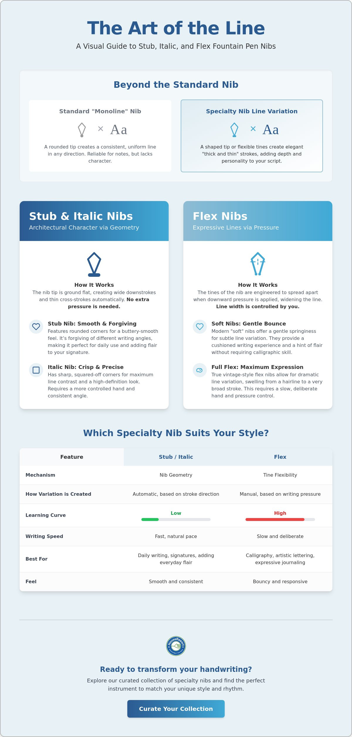
Stub vs. Flex: Which Specialty Nib Suits Your Writing Style?
Choosing between architectural shape and dynamic pressure depends entirely on your natural writing pace and aesthetic goals. This guide to stub italic and flex nibs emphasizes that a stub is a "set it and forget it" tool. It requires no change in writing pressure to produce results. In contrast, a flex nib is a performance instrument that demands active participation. While stubs provide a consistent, reliable flair, flex nibs offer a variable experience that changes with every sentence. The learning curve for a stub is almost non-existent. Flex nibs, however, require a period of adjustment to master the coordination between hand pressure and stroke direction.
Your choice of materials is just as important as the nib itself. Specialty nibs lay down a significantly higher volume of ink than standard round nibs. Using basic office copy paper will almost certainly result in feathering and bleed-through. To see the true potential of these grinds, you should utilize high-performance Japanese stationery. These papers are specifically sized to resist ink penetration, allowing the ink to sit on the surface where its shading and sheen can shine. Ink choice also matters. You'll need "wet" or high-flow inks to ensure the feed can keep up with the wide strokes of a stub or the spread tines of a flex nib.
The Writing Style Matcher
- Best for Fast Writers: The Stub Nib. If you take rapid notes or write long journal entries, the stub is your best ally. It adds character to your script without forcing you to slow down.
- Best for Slow, Deliberate Writers: The Flex Nib. Flex is designed for those who view writing as a meditative, artistic act. It rewards a slower pace with expressive, swelling lines.
- Best for Print and Block Lettering: The Italic Nib. The sharp, clean edges of an italic are perfect for those who prefer structured, architectural lettering over cursive.
Maintenance and Care for Specialty Nibs
Specialty nibs require a slightly more meticulous care routine. Because they utilize wider feeds to accommodate higher ink demand, they are more prone to ink buildup if left unused. Flush your pen with cool water every two to three weeks to maintain optimal flow. When using stubs or italics, remember that pressure is your enemy. These nibs are ground to a specific flat angle; applying downward force can misalign the tines or scratch the delicate tipping. For flex nibs, storage is key. Store your pens horizontally or nib-up to prevent the feed from becoming oversaturated. With over 15 million fountain pens sold globally in 2024, the community of enthusiasts is larger than ever. Proper maintenance ensures your heritage tool remains part of that growing tradition for decades.
BROWSE our full collection of specialty writing instruments at HouseResort Stationery.
Curating Your Collection: Finding the Right Specialty Nib at HouseResort Stationery
HouseResort Stationery serves as a dedicated destination for the discerning enthusiast. As an authorized retailer of heritage manufacturers, we view our role as boutique curators rather than simple vendors. In a similar vein to how Nicholas Wells Antiques sources rare items that define the character of a home, we've filtered the global market to present only the finest instruments that offer genuine craftsmanship. Our goal is to move beyond the transaction, helping you find a specialty nib that feels like a natural extension of your hand. Whether you're seeking a crisp italic for formal correspondence or a bouncy flex nib for artistic journaling, we provide the expert guidance needed to navigate these technical choices. This guide to stub italic and flex nibs is just the beginning of your journey into the tactile world of fine writing. We prioritize the prestige of established names like Pilot and Sailor, which act as benchmarks for quality and innovation in the industry.
Pairing Nibs with the Perfect Paper
A specialty nib is only as good as the surface it touches. Because stubs and flex nibs deposit a larger volume of ink, standard paper often fails to capture the nuance of the stroke. You'll need feather-resistant properties found in premium Japanese notebooks to prevent ink from spreading. For those who enjoy expressive writing on the go, we suggest the Traveler’s Notebook. Its modular design and high-quality paper inserts are ideal for capturing the dynamic lines of a flex nib. If you prefer a stub nib for long-form writing, the smooth, uncoated surface of Midori MD paper offers a perfect balance of feedback and flow. These materials ensure that your architectural strokes remain sharp and well-defined. Premium paper allows the ink to sit on the surface, preserving the integrity of every line.
When taking your creative tools on the road, protecting your collection is paramount; for premium, aerospace-grade aluminum travel cases that offer both security and style, check out ALEON.
Ink Recommendations for Maximum Variation
The interaction between your nib and ink is where the true magic of line variation happens. Stub nibs are particularly effective at showcasing "shading," where the ink pools at the end of a stroke to create a beautiful gradient. Using a high-quality option like Pilot Iroshizuku bottled ink enhances this effect, providing the lubrication necessary for a smooth experience. For flex nibs, high-saturation inks can emphasize the "sheen" or metallic secondary color that appears on the edges of broad strokes. Choosing the right ink isn't just an aesthetic choice; it's a functional one that prevents your specialty nib from feeling dry or skipping. A well-chosen ink transforms a simple sentence into a vibrant display of color and depth.
PILOT Pens EXPLORE our authorized selection. LAMY Calligraphy Sets DISCOVER your creative potential. HOUSE RESORT Stationery BROWSE our curated catalog for the perfect addition to your collection.
Elevate Your Analog Experience
Transitioning from a standard nib to a specialty grind is more than a technical upgrade; it's a shift toward more intentional, expressive communication. This guide to stub italic and flex nibs has highlighted how architectural shapes and dynamic flexibility can breathe life into your script. Remember that matching the nib to your natural writing speed is the key to long-term comfort. Whether you prefer the predictable flair of a stub or the responsive bounce of a gold flex nib, your tools should celebrate your unique hand—and to further explore the art of personal expression through scent, we invite you to visit Maison Ephyr.
We invite you to Explore our curated collection of fine fountain pens and specialty nibs at HouseResort Stationery. As an authorized retailer of heritage manufacturers, we provide expert-backed recommendations for every writing style. Our boutique approach ensures you find a tool that brings joy to every page of your journal or planner. Start your next chapter with an instrument that truly speaks for you.
Frequently Asked Questions
What is the easiest specialty nib for a beginner to use?
The stub nib is the most accessible entry point for writers new to line variation. Because it features rounded corners and requires no change in writing pressure, it feels very similar to a standard round nib. A popular recommendation for beginners is the TWSBI Eco equipped with a 1.1mm stub nib, which provides immediate character to your handwriting without a steep learning curve.
Can I use a flex nib for my everyday note-taking?
You can use a flex nib for daily tasks, but it requires a more deliberate pace than a standard nib. For high-speed note-taking, a "soft" or semi-flex nib like the Pilot Falcon is often more practical than a full flex nib. These options provide a cushioned feel and subtle variation without the high maintenance or ink demand of a vintage-style flex instrument.
Do stub nibs work for left-handed writers?
Stub nibs are excellent for left-handed writers because they don't rely on downward pressure. Many left-handed enthusiasts find that stubs are easier to use than flex nibs, which can catch on the paper during "push" strokes. This guide to stub italic and flex nibs recommends stubs for lefties who want elegant line variation without the frustration of tines digging into the page.
Why does my flex nib stop writing when I press down?
This issue is known as railroading, and it happens when the surface tension of the ink breaks between the spread tines. It usually occurs because you're applying too much pressure or writing too fast for the feed to keep up. To fix this, slow your writing speed and ensure you're using a high-flow ink designed for expressive writing.
What size stub nib should I choose for a standard A5 journal?
A 1.1mm stub nib is the ideal choice for the 5mm grids or ruled lines common in A5 journals. This size provides visible line variation while remaining small enough for legible, everyday writing. A 1.5mm or 1.9mm stub is typically better suited for large-format envelopes, headings, or formal calligraphy rather than dense journaling pages.
Are italic nibs scratchier than standard medium nibs?
Italic nibs offer more "feedback" than round medium nibs due to their sharp, unrounded edges. They aren't necessarily scratchy, but they are less forgiving of rotation. If you tilt the pen away from its sweet spot, the sharp corner will catch the paper. Proper alignment is the secret to a smooth experience with a formal italic grind.
Do I need special paper for specialty fountain pen nibs?
Specialty nibs perform best on premium, feather-resistant paper because they lay down a higher volume of ink. Standard office paper will often cause the ink to bleed through or spread, ruining the crisp lines of a stub or italic. Using this guide to stub italic and flex nibs alongside high-quality Japanese stationery ensures your writing remains sharp and professional.
Can any fountain pen nib be turned into a stub or flex nib?
A professional nibmeister can grind almost any sufficiently large nib into a stub or italic by reshaping the tipping material. However, converting a standard nib into a flex nib is much more difficult and often impossible. Flex requires specific metal thickness and elasticity that standard rigid nibs don't possess, making it better to purchase a purpose-built flex pen.